Problem
Most internet access in Cuba happens through Etecsa’s Nauta service: you authenticate against a captive portal to come online, and you manage your account, plan and balance somewhere else entirely. For years that meant desktop browser flows that didn’t share state — juggling tabs, copy-pasting credentials, and squinting at a portal page to work out how much connection time you had left.
The two systems behind those flows are nothing alike. One is a modern JSON API. The other is a legacy Java servlet portal that answers in HTML and was only ever designed for a browser to talk to. The app had to land on both exactly as they were, with no backend change to lean on.
The mobile surface
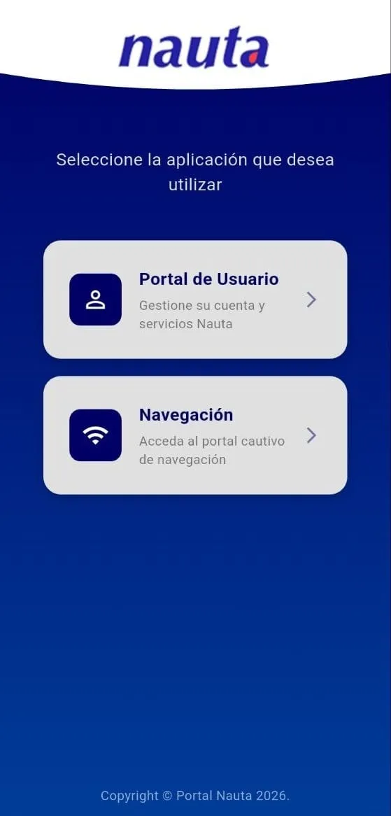
I built the Nauta mobile app end-to-end in Flutter, as the sole mobile developer. It ships as two apps inside one binary, chosen at an entry splash, because they are genuinely different products talking to genuinely different systems:
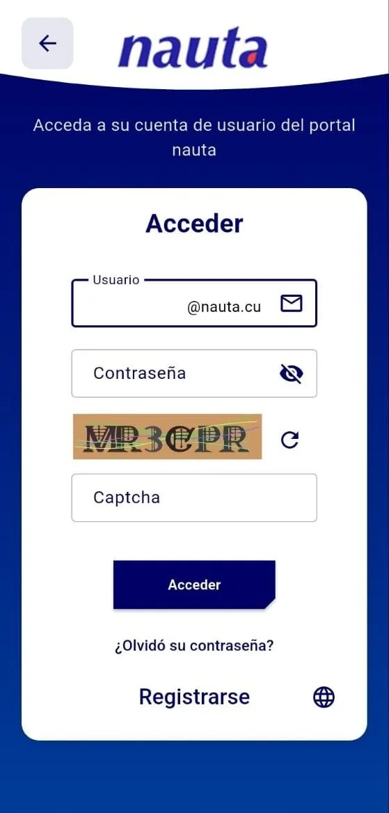
- Portal — account management against the Nauta REST API: login behind a server-issued captcha, profile and services, invoices, news, and the operations and consultations themselves, which are rendered as dynamic forms from parameters the API returns rather than hardcoded screen by screen.
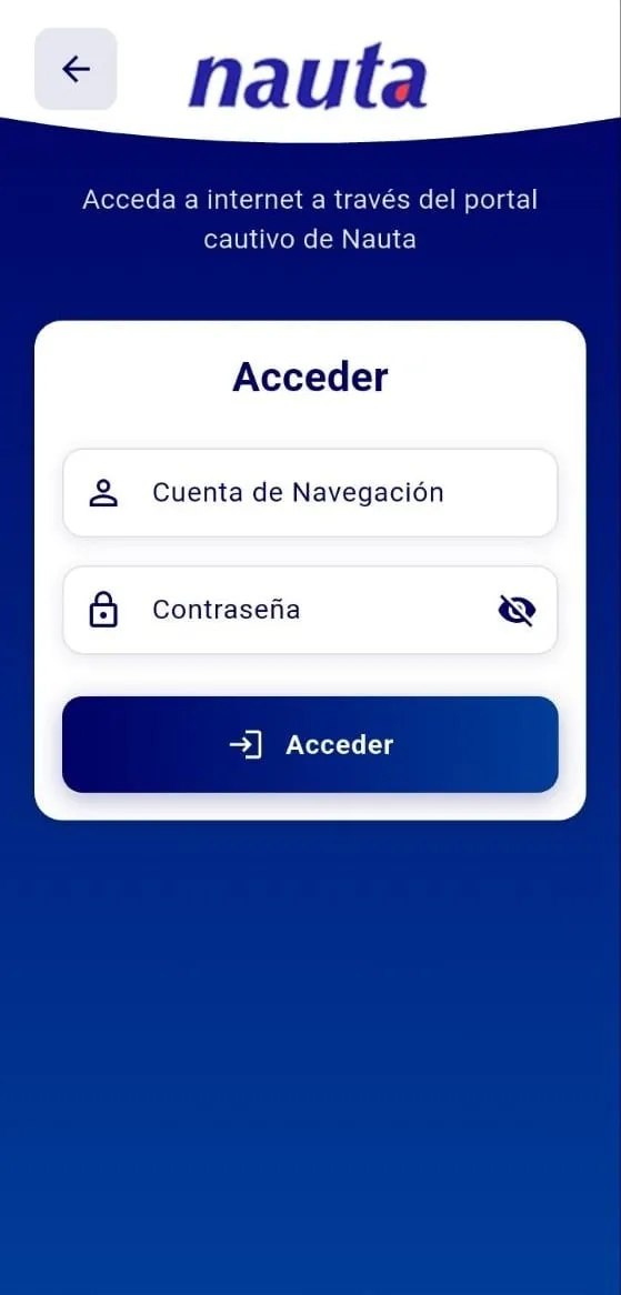
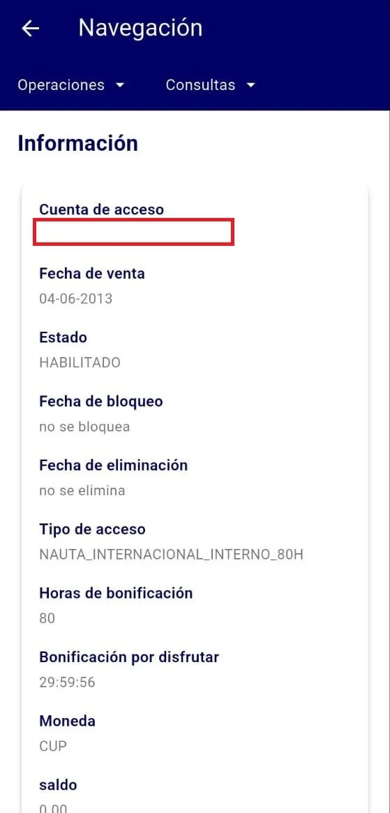
- Navegación — a captive-portal client for Etecsa Wi-Fi: log in, watch the remaining session time count down, log out, and keep saved accounts in secure storage for one-tap access.
The Portal side is deliberately a mirror of Etecsa’s public web portal at nauta.cu — same API, same operations, same account model, rebuilt as a native mobile product. I didn’t build that web portal; a teammate owned it and we worked the same backend contract from opposite ends. My job was parity: everything a subscriber could do in a browser had to work on a phone, without the browser.
Decisions worth calling out:
- One binary, two very different clients. The Portal side is a clean JSON API. The captive portal is a legacy Java servlet/JSP system that answers in HTML. Same design language, deliberately separate state machines and session lifetimes, so a session on one side can never bleed into the other.
- No WebView on the captive portal. The obvious shortcut is to embed a browser and let the user fight the portal’s own page. Instead the app reimplements the session as a pure HTTP client: it lifts the session tokens the portal only publishes inside its login page, keeps a cookie jar so the session survives across requests, follows the post-login redirect, and reads back the identifier the server buries in the returned page. That’s what makes it feel like an app instead of a browser in a costume.
- Success is inferred, not returned. The captive portal doesn’t answer with trustworthy status codes — it answers with a page. Login success is recognised by parsing the remaining-time string out of the body and confirming the response isn’t the login form again; every failure mode (bad credentials, already connected, no time left) is a separate typed failure rather than one generic error.
- The countdown outlives the UI. Session time runs in its own isolate behind a persistent notification, plus an optional native Android overlay with an independent timer and live speed meter. Kill the app and both keep running — because the thing a user actually needs to see is how much connection they have left.
- Honest about the captcha. The account portal requires a server-issued image captcha. I didn’t try to bypass it — the app refreshes the challenge on demand and treats it as a first-class part of the form.
Underneath, each feature is split domain / data / presentation with its own use cases and repositories, Riverpod for state, and typed failures via Either instead of exceptions thrown across layers. It builds for Android, Windows and Linux from the same codebase.
A note on the backend
Etecsa’s internal operational modules run on a legacy Javax stack. Separately from the app, I was assigned one of those modules to answer a scoped question: would Spring Boot actually be better? I ported that single module and drove both implementations head-to-head with SoapUI under comparable load — the Spring Boot port came out roughly 3× faster, and I wrote up the numbers as evidence for the platform decision. My scope ended there. It’s a measurement I own, not a migration I shipped.
Outcome
The app collapsed two browser flows into one product: get online, see exactly how much time is left, and manage the account without ever opening a browser. It shipped against both backends exactly as they were — and that’s the constraint that shaped every decision in it. When you can’t change the system underneath, the engineering is absorbing its shape so the user never has to.